The Art of Color Coordination: Interior Painting Tips by 4 Seasons Painting LLC
Choosing the perfect color scheme for your home's interior can be an overwhelming task, especially with the vast array of color options available. The right color combination can elevate your living space's aesthetics, reflect your personality, and create a harmonious environment that you'll love to live in for years to come. As a family-owned and operated painting company, 4 Seasons Painting LLC understands the importance of selecting the perfect color palette for your home.
In this article, we'll share some expert tips on color coordination for interior painting projects to help you create beautiful, well-balanced spaces tailored to your unique tastes. Continue reading and let 4 Seasons Painting LLC guide you through your next interior painting project, creating a stunning visual experience that's uniquely yours.
Exploring the Color Wheel and Color Schemes
As mentioned in the introduction, understanding the color wheel is vital for successful color coordination. The color wheel features primary colors (red, yellow, blue), secondary colors (green, orange, purple), and tertiary colors, which are created by mixing primary and secondary colors. With this foundational knowledge, you can explore different color schemes to create various visual effects:
1. Monochromatic: Incorporating various shades, tones, and tints of a single color creates a monochromatic color scheme. This approach offers a cohesive and harmonious look that can either be subtle or dramatic, depending on your color choice.
2. Analogous:
Utilizing colors that are adjacent to the color wheel forms an analogous color scheme. This scheme creates a soothing effect and works well in bedrooms or living rooms where a calm atmosphere is desired.
3. Complementary:
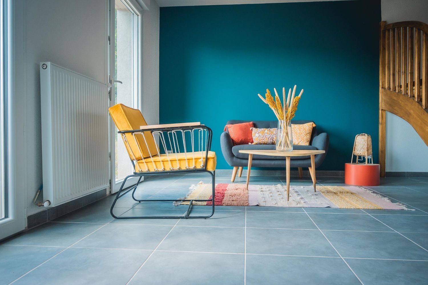
Combining colors that are opposite each other on the color wheel constitutes a complementary color scheme. These bold, high-contrast palettes can add energy and excitement to a space.
4. Triadic: Drawing from three evenly spaced colors on the color wheel produces a triadic color scheme. This vibrant and balanced color combination is perfect for adding a sense of playfulness and creativity to your home.
Setting the Mood with Color Choices
Colors can significantly impact the way we perceive our surroundings and the emotions we experience. When selecting colors for your living space, consider the atmosphere or mood you want to create:
1. Energizing: Warm colors such as reds, oranges, and yellows can stimulate activity and excitement, making them perfect for socializing areas like the living room or dining room.
2. Relaxing:
Cool colors like blues, greens, and purples can create a calm and soothing environment, ideal for bedrooms, bathrooms, or quiet corners in your home.
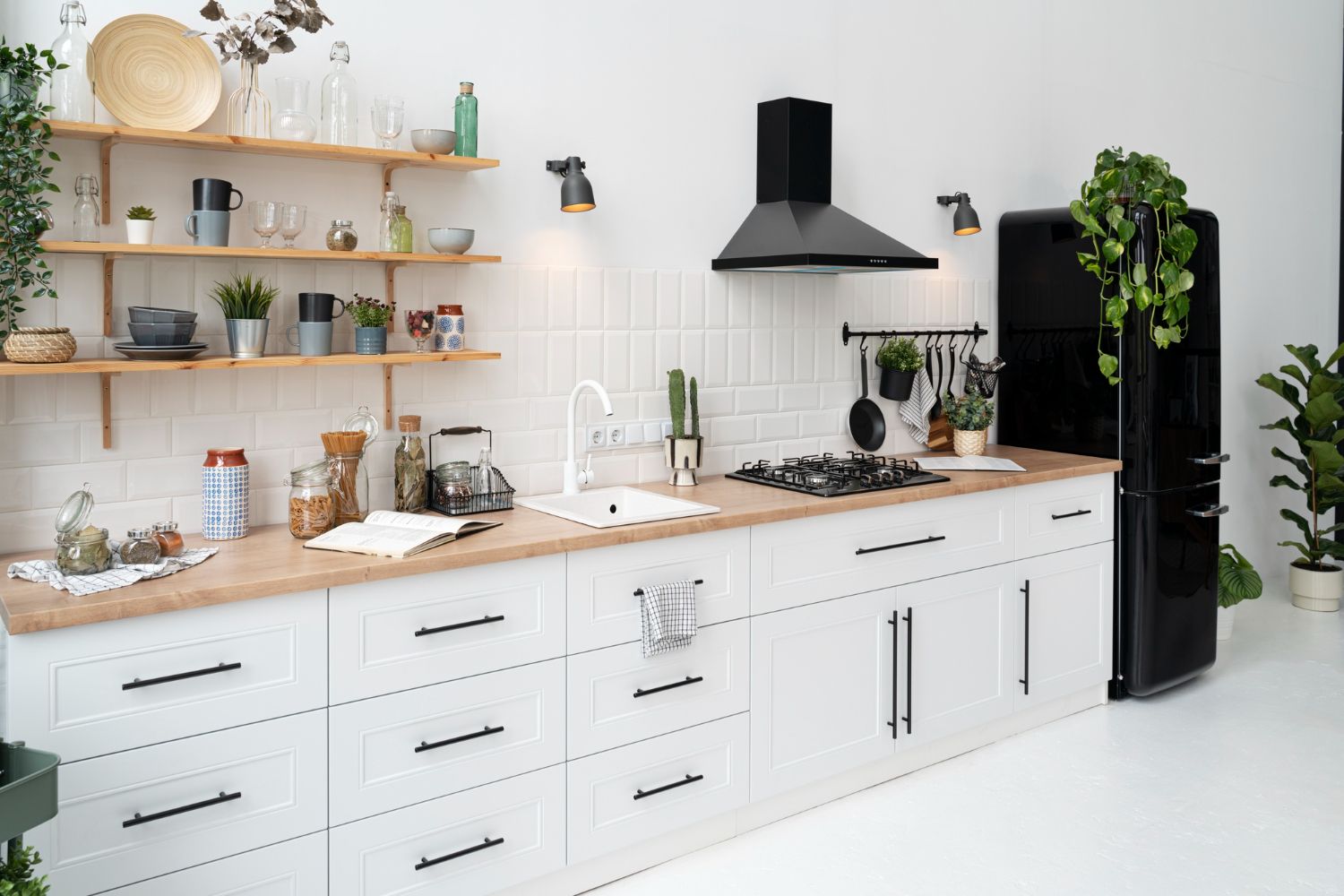
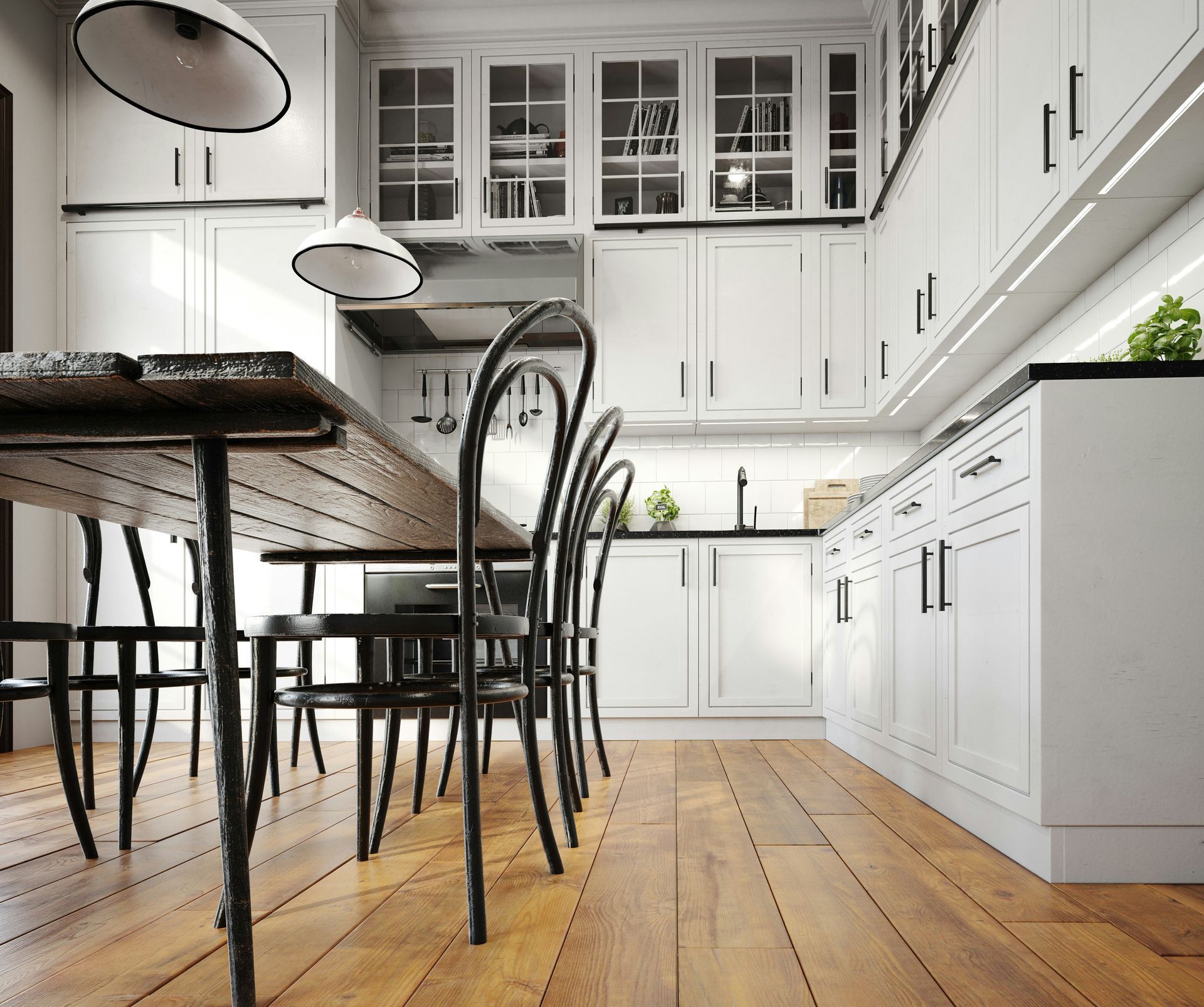
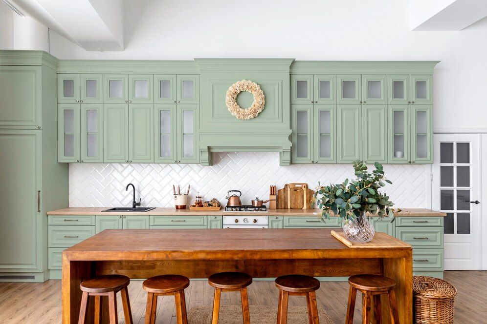
3. Neutral: Neutral colors, such as greys, whites, and muted earth tones, can strike a balance between bold and subdued. They can be used as a backdrop for more vibrant accent colors or to create a sophisticated, clean look in your space.
Understanding the Impact of Lighting on Color Coordination
The lighting conditions in your home can dramatically alter the appearance of your chosen colors. Keep these factors in mind while selecting your color palette:
1. Natural Light:
Colors can appear different based on the position and intensity of sunlight in your space. South-facing rooms receive more natural light, making colors appear brighter, while north-facing rooms tend to have a cooler, more diffused light that can make colors look subdued.
2. Artificial Light:
Different types of artificial lights can also affect the way colors appear. Warm, yellow-toned lights can make colors look warmer, while cool, white lights can make colors appear cooler or more neutral.
3. Paint Finish: The paint finish you choose can also impact how colors appear in your space. Glossy finishes can create a reflective surface that can result in a more amplified and vivid color appearance, while matte finishes can create a more subdued effect.
Taking Inspiration from Your Existing Décor and Architectural Elements
Incorporate elements from your existing décor, furniture, and architectural features to create a cohesive and personalized color scheme. Some tips to consider include:
1. Accentuating Architectural Features:
Use contrasting colors to draw attention to unique architectural elements like crown molding, wainscoting, or built-in cabinetry.
2. Building Around Focal Points:
Choose a color palette that complements focal points in your space, such as a statement piece of furniture, an artwork, or a feature wall.
3. Creating Flow Between Rooms:
Select colors that work well together for adjacent rooms to create a sense of continuity and harmony throughout your home.
Elevate Your Home with the Perfect Color Coordination
Color coordination is an essential aspect of interior painting that can transform your home and create an environment that is both visually appealing and emotionally satisfying. By understanding the fundamentals of color theory, considering the desired mood, evaluating the impact of lighting, and incorporating inspiration from your existing décor, you can create a beautifully coordinated and harmonious space.
Let 4 Seasons Painting LLC assist you in achieving the perfect
color coordination for your painting project, adding beauty, elegance, and personality to your living spaces. Contact our team of expert today!